Project Overview
Context:
A conceptual solo project provided by Google as part of the UX/UI Certificate program.
Project Duration:
March 2021 - August 2021
Role:
UX designer, UX Researcher, Visual Designer
Tools:
Figma, Balsamiq, Miro

The Problem
How might we help users reserve tickets in advance and preview their seat distance from the screen before entering the theatre?
The Goal
Users need to be able to preview seat location, know the distance of desired seats from the projector screen and checkout seamlessly.
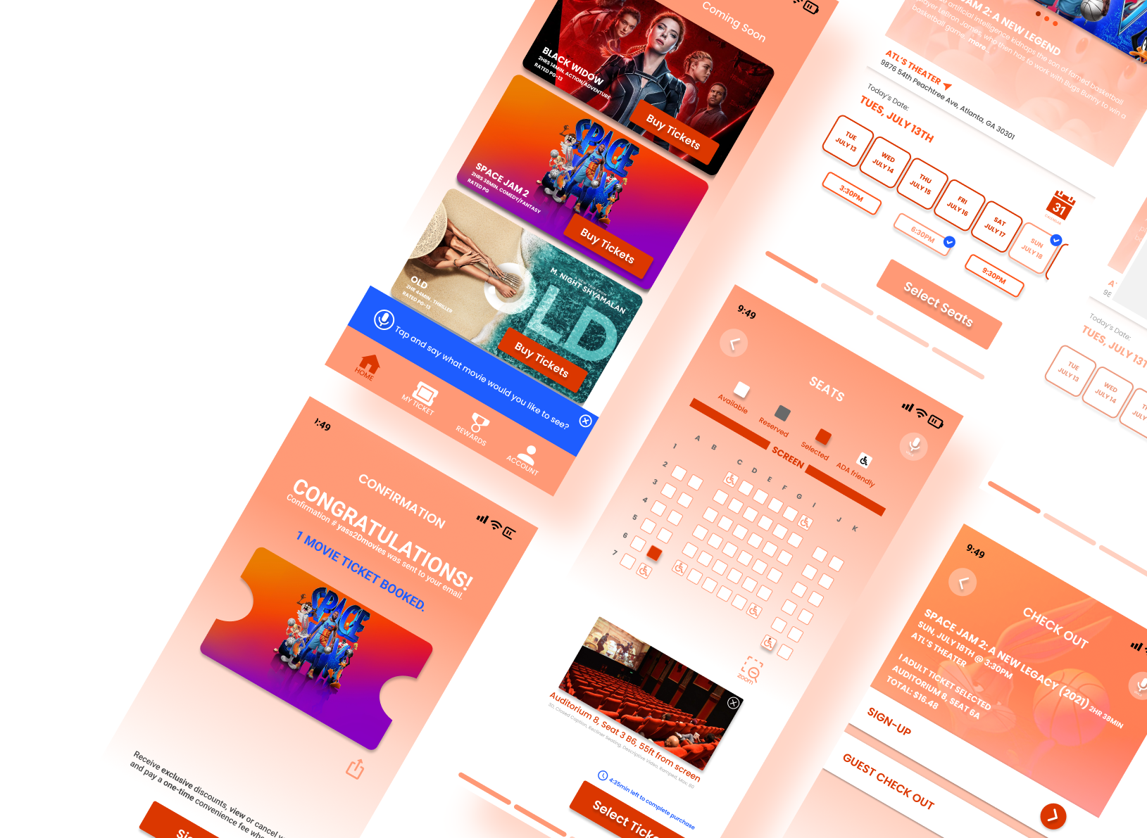
The Solution
A mobile application that provides visible seat labels, an image preview when making a selection and seat distance displayed on screen so users can make better decisions on seating without feeling anxious before going to the movie.


Understanding The User
“I don’t like paying the convenience fees every time I buy online”. - A grandparent
“I hate it when the seats are a lot closer to the screen than what it looks like on the app”. -Movie Goer
“I’d like to be able to check out as a guest as I don’t go to the movies often”. - Solo goer
“Too many ads and pop-ups. I just want to book a ticket”. - Movie buff
The initial step was to interview six relevant users to survey their ticketing experience and what products they use to book their movie tickets online.
Next, I sketched out two storyboarding scenarios to visualize user emotion and how they may interact with the product.
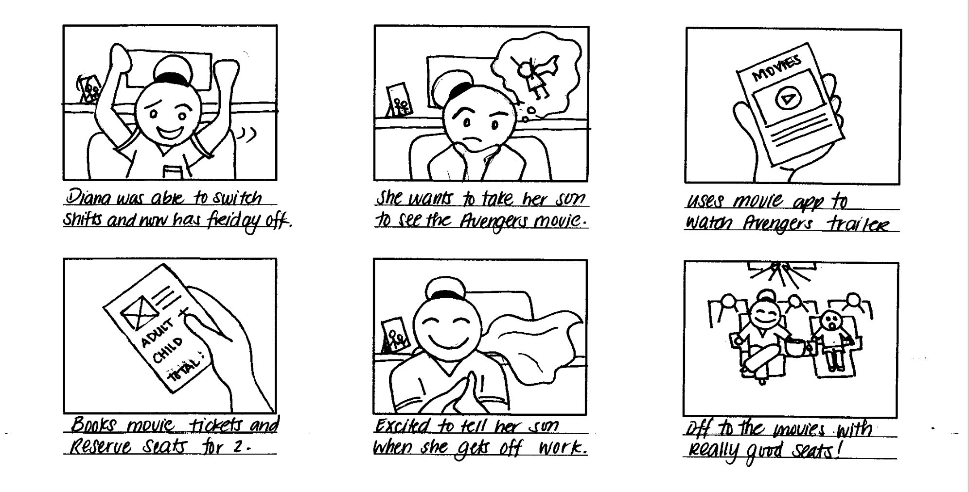
Big Picture Scenario

Close Up Storyboard
User Journey
By mapping out user thought process and emotional journey from start to finish, it provided insights on the number of steps it will take for them to complete their task, potential frustrations, and areas of design opportunities.

User Pain Points
After collecting data from user interviews, I organized common user pain points into four categories:
Time
Movie goers would rather skip the ticket line and head straight to the concession or auditorium.
High convenience fees per transactions prompts users to buy tickets in person.
Accessibility
Platforms for booking movie tickets are not equipped with assisted technologies.
App will not allow users to leave an empty seat when booking a single ticket.
Emotional
Movie goers feel anxious if they can’t reserve seats ahead of time especially if they need multiple tickets.
Movie goers also feel disappointed when seats are too close to the screen compared to what is shown online.
AI
Movie information, images and details at times takes too much real estate on the screen.
Too many pop up advertisements.
Personas
Two personas were identified from the above data based on user needs and frequency of use.
The first group is consisted of users who downloads the app out of convenience to reserve seats but bothered by high fees, pop-up ads and lack of check out options.
The second group of users are movie buffs who books tickets in advance, have seat preferences and subscribes to membership.


Design Process
Paper Wireframes
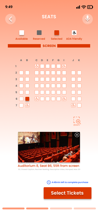
The main focus of the app is the seat reservation screen so I drew five different versions on paper keeping in mind user pain points and refined it with all the elements I like on the final version.

Five variation of the seat reservation screen

Final paper version
Digital Wireframes
Once I finalized the seat reservation screen on paper, I transferred the design digitally and added a series of user task flow screens to test on a prototype.

Low-Fi Prototype
The main user flow was to select a movie, date and time, reserve seats all the way to checkout. I decided on the sequential flow because it guides users to complete their task from start to finish.

Usability Study
A usability study was conducted to test user flow, accessibility concerns and overall initial design of the project.

Round 1 Insights:
Call to action buttons were not big enough for users; Users need larger buttons to interact and press
The zoom buttons were mistaken as adding or subtracting a seat; Users need clear labels on icons to avoid confusion
The spacing between elements are too narrow; Users need enough space between the date selection to avoid choosing the wrong one
Users prefer to view available seating first before buying tickets; Users can make an informed decision whether or not to select a different date or time based on availability if seat selection comes first before adding number of tickets.
The seat reservation screen is distracting; reducing the amount of colors and re-arranging elements will create a cohesive look.
Design Iterations
Before Usability Study

After Usability Study

Adjustments
The date selection on the carousel were limited so adding a calendar will allow users to book tickets more than a week in advance.
The date are clearly confined in its own element for legibility and easier interaction.
Adding a check mark confirms user selection and provides a state of response from the app.
Adjustments
The zoom button was replaced with a universal icon and a label that clearly represents the intended action.
The spacing between seats are re-configured and spaced out for legibility and easier interaction.
The share button was removed because users didn’t see the benefit of this feature on this screen.
The timer is re-sized to reduce distraction and a monochromatic use of colors create a cohesive look.
Before Usability Study

After Usability Study

Accessibility Considerations

WCAG approved contrast for low vision
Placeholder texts in field forms
Second state as a response to user interaction
Larger call to action buttons
Breadcrumbs to guide users where they are throughout the app
Voice and Scan ID options for users with limited mobility
The Solution
Users can confidently book movie tickets in advance knowing exactly where it is located and an option to check out as guests.
Members can quickly and seamlessly check out and view tickets instantly.
Takeaways
Impact:
After the second round usability study, participants loved the simplicity and ease of use of the app. They also enjoyed the fresh color scheme and the ability to use voice command throughout the selection process.
What I’ve learned:
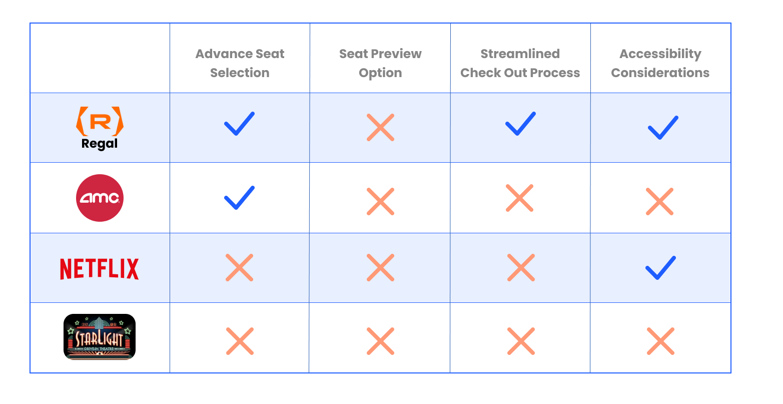
Throughout this entire process, I learned to seek feedback and put users first. I particularly enjoyed the iteration process both addressing user pain points and business needs. I made better informed design decisions by conducting a competitive audit and analyzing what is working and lacking in the current market especially in regards to accessibility.
What’s next?
Conduct another round of usability testing to validate whether the pain points users experienced have been addressed.
Conduct more user research to determine any new areas for improvement.
Dive deep into accessibility design.