
Project Overview
Context
A conceptual solo project for a responsive mobile first approach app
My Role
UX Research
End to end UX Designer
Duration
Dec. 2021 to Feb. 2022
(6 weeks duration)
Tools
Figma, Miro & Balsamiq
Background
Majority of schools in North America do not include financial literacy as part of the curriculum. Many young adults do not have a clear understanding on how to handle their personal finance.
The Problem
How might we help young adults learn about basic finance, set up financial goals and budget to help prepare them for the real world?
The Solution
An educational digital platform that is automatically synced, personalized and gamified with real life rewards to enhance user engagement, promote productivity and user retention.

User Research

“Very challenging topic, especially for those who are struggling to save while paying for bills, studying, and maintaining a life style”
- College student
I needed to gain an understanding of the financial literacy space for young adults so I conducted six user interviews with relevant user groups to identify motivations, frustrations and goals.
“It's not very easy to understand at a glance and the terms are sometimes very confusing”
- Recent college graduate
“A lot of people do not even think about this as a concept because we are not taught HOW to save money besides "just working hard."
- New working professional
Secondary Research

Data visualization by Mia P.
To further support the need of a financial literacy platform, secondary research reveals that majority of young adults in America were not taught about basic finance.
“74% of teens don’t feel confident about their financial education”. - ChooseFi
“32% of teens can’t identify the difference between a debit and a credit card”. ChooseFi
“53% of college students felt less prepared to manage their money”. Lexington Law
“70% of millennials are living paycheck to paycheck”. Business Insider
Competitive Analysis
I also conducted a competitive analysis on these four digital products mentioned by users as one of their financial literacy sources to figure out industry gaps.
It uncovered an opportunity to design an app that offers digestible information, has gamification features and incentivize users to stay engaged with the product.

Personas
There were two main user groups identified from my interviews. These personas helped reveal the need for an educational platform, the importance of an engaging product and identified three key insights to focus on.
Adante needs an educational platform he can trust to help prepare him in every financial decision.

Bella needs a digital product with bite-sized information that can help her track and improve her finances to stay accountable.

Key Insights
My research discovered that users have core needs to attain financially literacy.
Personalized
Users have different goals and motivations based on age, background and experience.
Measurable
Users need to track goals and progress without feeling overwhelmed.
Engaging
Users need to stay connected and consistent to learning about financial needs as they navigate through different life stages.
Next, I listed each persona’s typical step process and emotion while navigating the app to make an informed design decision.
Ideation Process
With the above data, I began to build a sitemap that includes necessary information about the product without overwhelming the users and kept the design consistent and responsive to all devices to avoid user confusion.
Users need to know what the product is about before signing up.
Users need to know if they can trust the product or how it would benefit them.
Relevant topics, rewards, tools, resources and customized options are provided to make it personable for users.

With the information architecture in place, I ideated tasks and flow ideas on these onboarding screens keeping in mind user frustrations, goals and key insights.

After first time users download the app, they are presented with walkthrough screens to introduce the purpose of the app: bite-size information on financial topics with incentivizes and rewards to capture user interest.
Once users are logged in, they can customize their avatar to make it more personable and fun to kick off the gamification feature for user engagement.

Users can also sync external bank accounts to increase time of investment on the app.

I addressed personal goal customization based on user’s financial needs.
A quick round of usability testing was performed and uncovered user’s preference to present the goals as a list instead of entering information manually to avoid drop offs.

Since an external account has been synced, users also stressed the need to add a budgeting section without visiting another app.

Wireframes

Following the onboarding screens, I then designed digital wireframes and tested a lo-fi prototype of the main user flow to educate users on basic finance and a quiz section to test user engagement.
Accessibility considerations were also emphasized early on the reading module since users will be spending most of their time on this screen.
Text to audio for low vision
Page identifier & search button
WCAG standard button
Usability Testing
Two usability studies were conducted to ensure my designs meet user needs and address their pain points. I sent out a series of task lists for users to complete while interacting with my prototype and noted their responses into an affinity map.
I’ve found one major frustration to address.
4 out of 5 users were having difficulty finding the “Edit Topics” to begin the initial task.
If users can’t locate this button, they are unable to access new topics and will cause user drop offs. A new placement and larger cues must be considered.
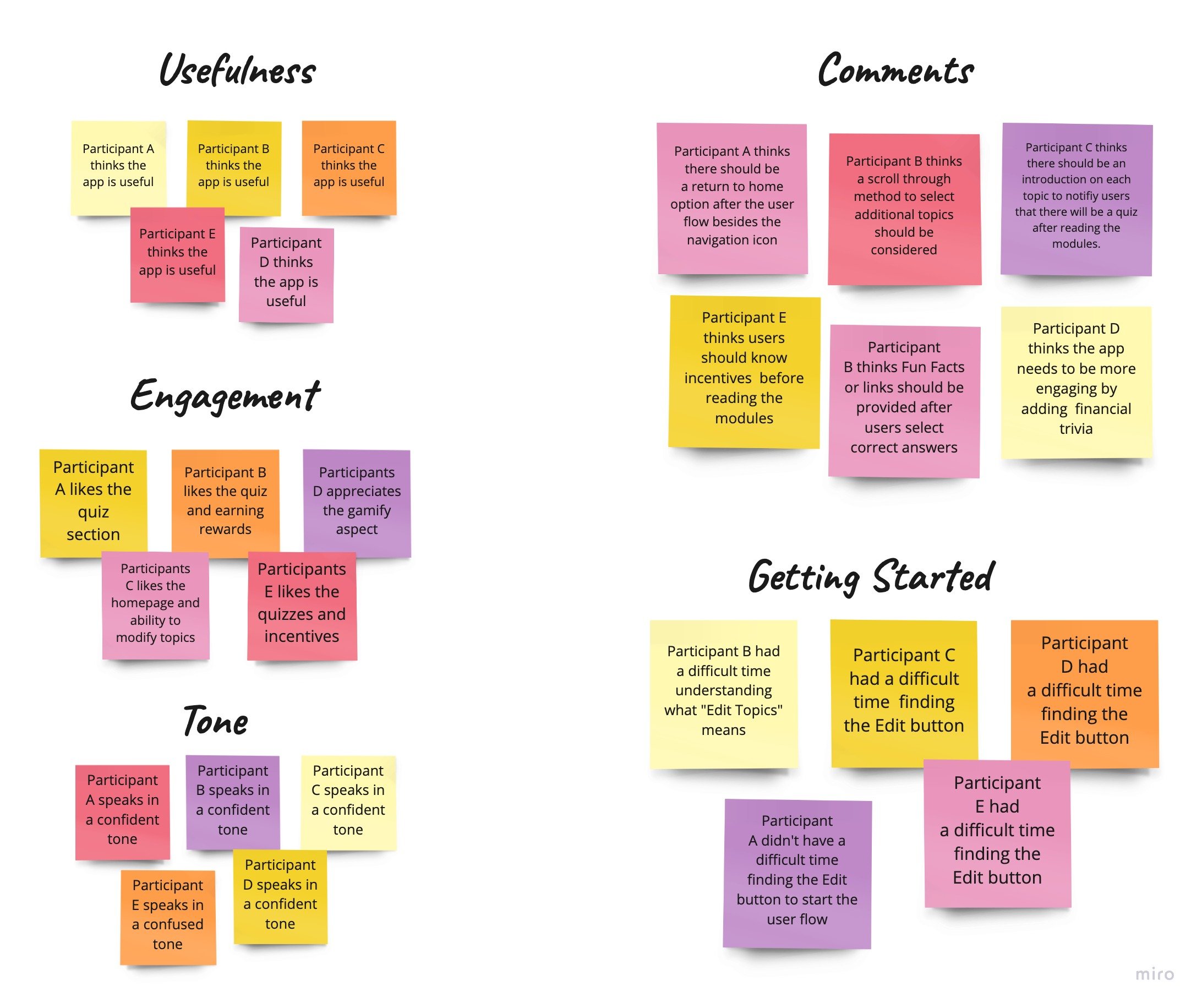
Some additional insights from user feedback:
3 out of 5 users expressed the lack of visual interaction.
2 out of 5 users recommended a budget section so they can track spending.
2 out of 5 users wants to visibly see their rewards or incentives for motivation.
Although these features do not interfere with the user’s ability to finish their task, adding a budgeting section will allow users to personalize their financial goals and track for accountability. Adding rewards on the main navigation will allow users to view potential prizes for motivation resulting in an increased engagement.
Iterations

With user feedback in mind, I added more appealing visual elements, a budget tab, and a rewards section on the main navigation.
5 out of 5 users reported after testing that they enjoyed the incentives of taking quizzes, the options of topics and would use the app themselves.
The Solution
An improved and cohesive home screen showcasing financial goals, personal budget and earned rewards and an accessible design for the user.
Homescreen
Stash home screen takes users right on their readings, budget and financial goals.
Here users can access their profile, points, rewards, browse financial topics, reading tools or community forum.
Rewards
Adding a rewards icon on the navigation bar so users can easily access their earned rewards and browse prizes.
Incentivizing users with rotating real life rewards will keep them motivated to interact with the product.
Quiz Time
Users will have the option to take a quiz after reading their module or return home.
The interactive quiz section shows fun facts and scores increasing user involvement and motivation.
Lessons Learned
Formulating the right questions to ask users during the initial interview and usability testing is important and will prompt helpful insights and reduce confusion from users.
Be specific of which part of the app you are testing for a more focused solution.
Address user pain points by testing ideas throughout the design process.
What’s next?
Conduct more user research to determine any new areas for improvement.
Conduct another round of usability study to validate whether or not the user pain points has been addressed, the app is accessible and if features are motivating enough for users to consistently interact over an extended period of time.